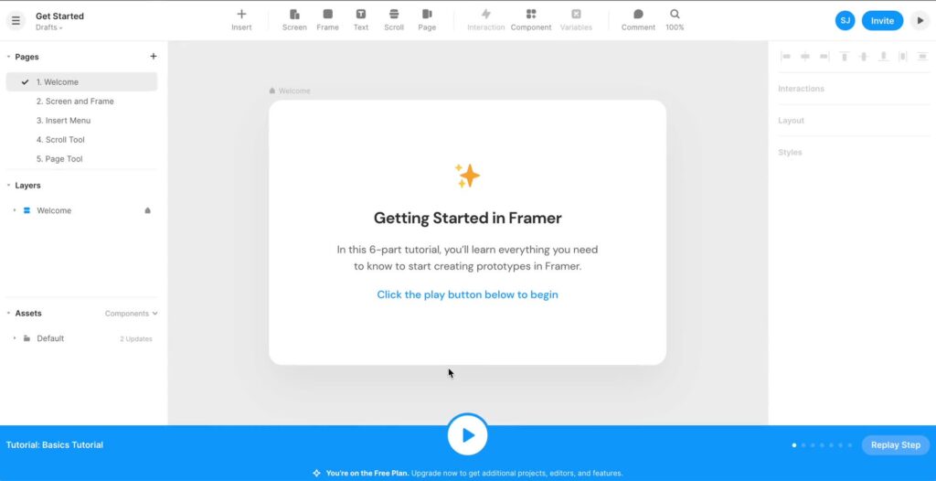
Framer is predominantly known as a prototyping tool, but its expanded features make it suitable for designing interactive sites. In this tutorial, we’ll create a simple blog layout using Framer. Before you start, consider finding a free or paid Framer template you like. For example Pressvault is a popular Framer template for writers and bloggers.
Prerequisites:
- A Framer account.
- Basic understanding of Framer’s user interface.
1. Set Up a New Project
- Log in to your Framer account.
- Click on ‘New Project’ and select a blank canvas.
2. Designing the Blog Layout
Main Blog Page:
- Header:
- Use the rectangle tool to create a top bar.
- Add the title of your blog using the text tool.
- Optionally, add a navigation menu with links like Home, About, Contact, etc.
- Blog Posts:
- Use the rectangle tool to create a card for the blog post.
- Insert a placeholder image at the top of the card.
- Below the image, add a text element for the blog post title.
- Add a smaller text box below the title for the post’s summary or a short excerpt.
- Optionally, add a ‘Read More’ button at the bottom.
- Sidebar (Optional):
- Create a narrower rectangle on one side of the page.
- Add elements like “Recent Posts”, “Categories”, or any widgets you’d like.
- Footer:
- Use the rectangle tool for the footer bar.
- Add any copyright information, links to privacy policies, or social media icons.
Individual Blog Post Page:
- Header: As with the main blog page.
- Content:
- Add a large text element for the blog post title at the top.
- Insert your main blog content below. You can use a scrolling frame if the content is long.
- Comments Section (Design Only):
- Add text boxes for the name and comment fields.
- Add a ‘Submit’ button.
- Footer: As with the main blog page.
3. Adding Interactivity
- Linking Blog Posts:
- On the main blog page, link the ‘Read More’ button (or the entire blog card) to the individual blog post page using Framer’s linking tool.
- Navigation:
- Link the navigation menu items to the respective pages or sections.
4. Making It Responsive
Framer offers various tools to ensure your design is responsive:
- Scaling: By default, Framer sites use scaling options on mobile, presenting a scaled-down version of your desktop site.
- Breakpoints: To customize content and layout for different sizes, use breakpoints. Place them visually next to each other, and Framer will seamlessly integrate with CSS using media queries.
- Responsive Elements: Use responsive elements like Stack and Grid with options like
min-widthorflex-wrapto automatically adapt to various sizes.
5. Publishing
Once you’re satisfied with your blog design:
- Click on the ‘Publish’ button on Framer.
- Choose a domain or use a Framer subdomain to make your blog design live.
Conclusion:
While Framer lets you design an interactive and visually appealing blog, remember that this tutorial focuses on design and interactivity. For an operational blog with backend functionality, content management, etc., you’d still need a dedicated blogging platform or CMS. Nonetheless, Framer can be a fantastic tool to visualize, prototype, and even get initial feedback on your blog design.
